16 April 2018 / 49 Comments
How I create images for a magazine – an article for Sister Mag
Aaaaaaa!!! THIS IS GOING TO BE SO MUCH FUN! That was the first thought that flew into my head as soon as I heard the idea for the new magazine feature that Sister Mag wanted me to work on for their March Issue about Mary Poppins. I mean, who doesn’t like Mary Poppins?
The idea was to create a collection of 3 sweet recipes along with the images for a feature titled ‘A spoonful of sugar’ and the team gave me all the creative freedom to interpret this idea.
Ready to hear all about my creative process? Then grab a cup of tea, put your feet up and enjoy the reading! And don’t forget to let me know what you think in the comments below!
Just a little note here:
Before I’ll take you on this journey through my process of creating, I really want to highlight that none of these steps should be taken as stiff rules to follow. I am a huge believer that all rules should be stretched, bent or broken. I don’t want to impose things that work for me onto you. Every project is different. And most importantly, every creative person is different – YOU DO YOU!
Stage 1 – BRAINSTORMING THE THEME
The first question I always write down when planning my work is:
How do I want the viewer to feel my image?
You don’t see a photograph, you feel it.
Just think about it for a moment. Everything in life is about how we experience it. How it makes us feel. Art, people, day to day situations. We can be scrolling through our instagram feed feeling uninspired and then we suddenly stop the second we ‘see’ that striking image that makes our heart beat faster. But we don’t just see it, we feel it. We connect with it straight away.
We have strong (positive or negative) emotions or no emotions at all about something before we can even describe WHY it makes us feel that way. We know instantly if we like a photograph or not, but it takes us longer to figure out what is it about the details that makes us feel that way.
We feel something- before we think about it- that’s the emotional nature of human beings. Which as you know, might make life complicated sometimes 🙂
EVOKE EMOTIONS
In photography, however, thinking about these emotions can make the process of creating easier. The minute you decide to embrace the emotional nature of your viewer and take her/him for a beautiful ride with your imaginary, that’s when the true connection happens. How we want the viewer to feel will determine the overall mood, light, colours, food (if you develop the recipe), props and background, angle,composition and styling you choose for your photograph. Really,it determines ALL YOUR CHOICES for creating the image.
This thought wouldn’t leave me as I was discovering my style at the early stages of my photography journey, and it changed totally how I approach my photography process these days. It’s all about evoking these emotion in your viewer! Not everyone will connect with your art and your message and that is TOTALLY OK. But knowing what emotions you want to evoke with your images will allow you to create your work more intentionally and will give you the CLARITY of how to capture that striking photograph.And isn’t that what we are all striving for?
BRAINSTORM the theme or RESEARCH IT
For my personal projects I usually have a strong vision in mind of what story I want to tell and I will only do a research if I experiment with colours that I’ve never worked with before, or food that is new to me, or I want to try an idea that is different to my style.
For my client work – if there is no brief – I always do a research, because I am working with someone else’s idea and I want to explore this idea to make sure I interpret it well.
When I did a research about Mary Poppins, these few things stood out for me the most – colours (whites & reds), kites, umbrella, Britishness and the famous lines from the musical, and these few words echoed in my head:
- fun
- playful
- vibrant
- feminine
- dreamy
Ta dah! I had the mood for the article!
Stage 2 – MOODBOARD
The next step is to put all these wild and fun ideas into a united vision to see what works together and what is best to leave out.
Here is what my Pinterest moodboard for this feature looked like.
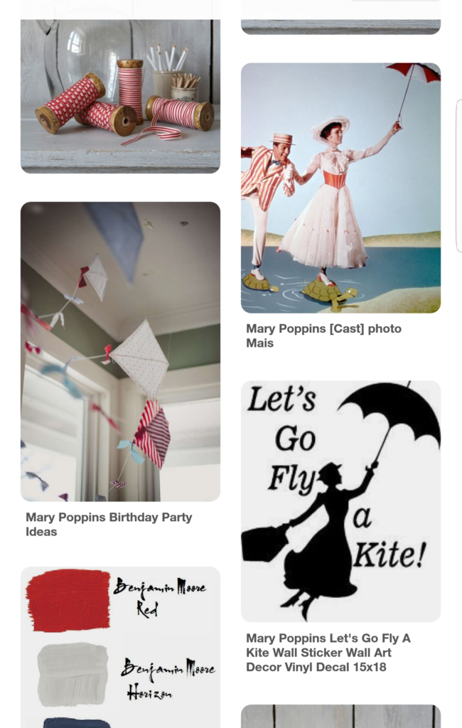
What idea does this collection give me?
- The colours that I’ll use- white and red – which perfectly highlight my theme and the vibrant mood of this feature. The colours you use impact the overall mood of your images. TREMENDOUSLY!
Something you have probably already noticed in my work is that I play with colour A LOT. It’s because I am FASCINATED by colour psychology and how certain colours impact our emotions. (But that’s a topic for another conversation). - I’ll add an element of polka dot or stripy pattern – to make the feature more fun and playful
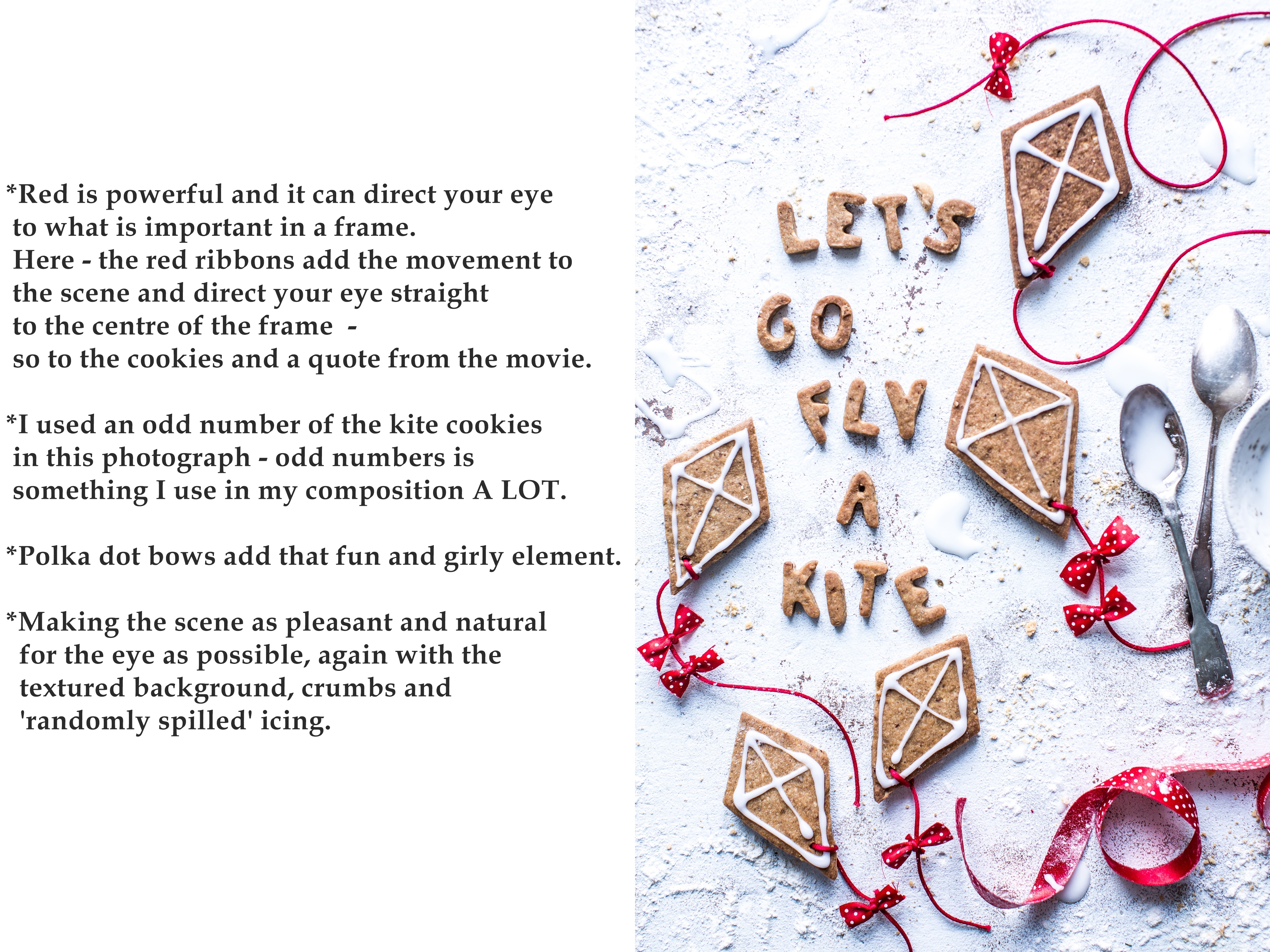
- I’ll add something of a shape of a kite or umbrella in food styling – to add a fun element and create all these ‘Mary Poppins’ feelings
- I’ll use lace napkin or cloth – for the girly touch
- I’ll incorporate typography with famous lines from the musical
You can see that there is no food images here that inspired this article. It was inspired by the movie.
There is nothing wrong with being inspired by other food images (I am all the time!!!!), but it’s always interesting and valuable if you can bring inspiration to your food photography from other fields, like for example from film or design.
Stage 3 – Marrying the idea with the food and props.
It’s time to bring these details to life by choosing the right props and the food that will be the main star of the story.
FOOD
You can’t always choose the food that you will be working with but in this case I was responsible for the recipes too. I started by writing down few sweet recipe ideas that would reflect the mood of the story, so connect with all these words I collected in the last two stages. I ended up choosing 5 recipes that I tested, picked the best 3 and tested them again.
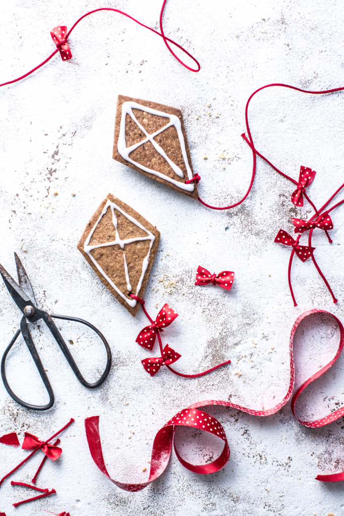
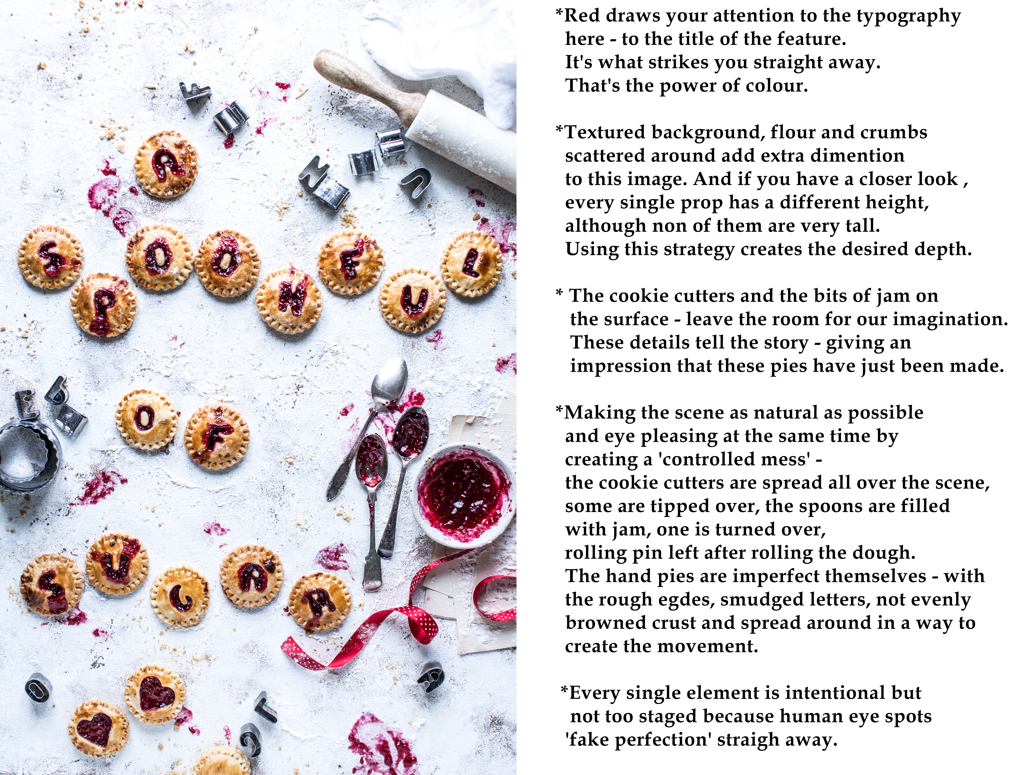
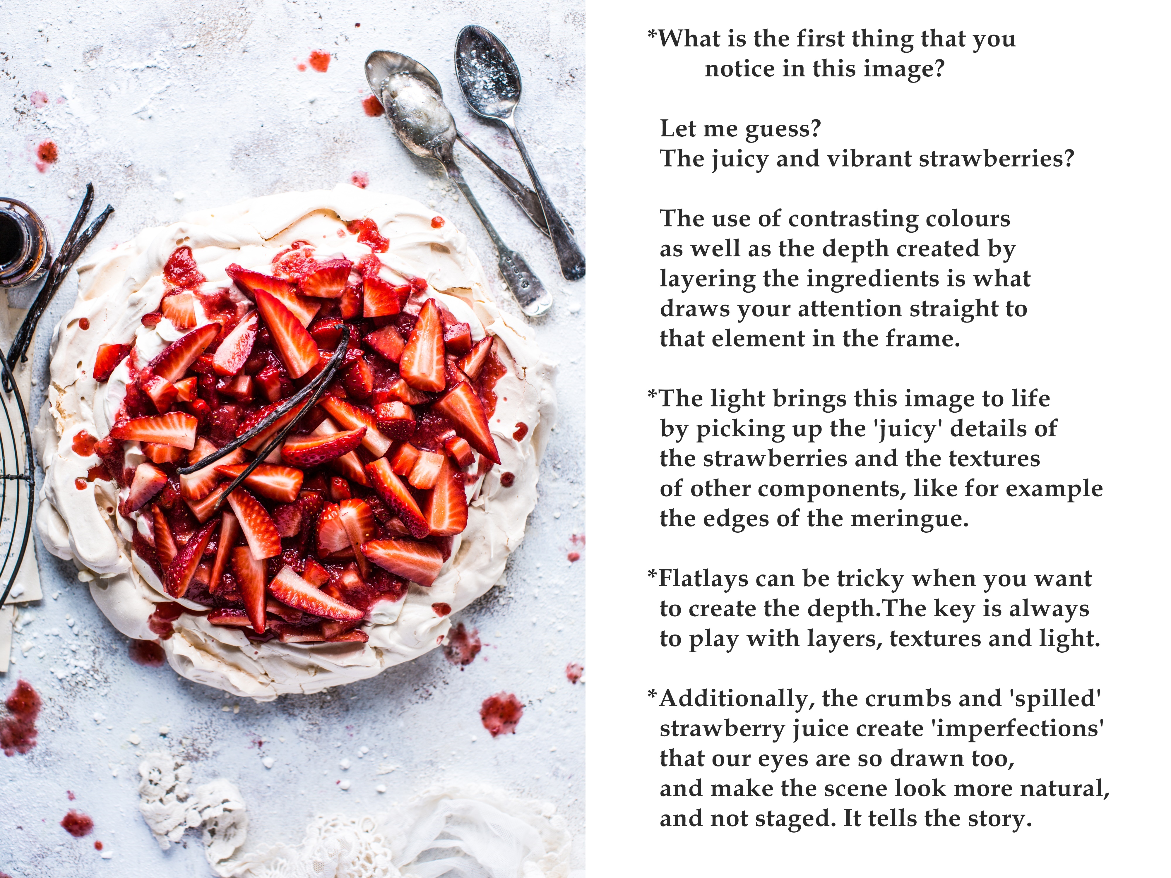
At this stage I had hand pies that were a creative canvas for the title of the feature ‘A spoonful of sugar’, cookies that would be cut into kite shape and hold well after baking. And of course there is nothing more sweet and more British that Eton Mess 🙂 In this case I went for Eton Mess Pavlova.
PROPS
As for the props – I chose the spoons to reflect the title of the feature. A red ribbon – as this is something you see in the movie a lot and it would add a fun element and movement to the styling. And just few more little bits and pieces to support the story of the food, but which were not too distracting from the main subject – like cookie cutters, book pages, vanilla, jam and icing sugar.
The propping is very minimal here – the food tells the whole story and the red colour helps to draw your attention to the most important elements.
COLOUR
As red is an attention grabbing colour – and can be overpowering – I only used red here to highlight the IMPORTANT things in the photographs – like typography, lines that draw attention to the important elements in a frame, and to add lot’s of depth to the image (like in the pavlova example below).
Stage 4 – Executing the idea
IT’S FUN TIME!
LIGHT
As the light is the main component in telling your story, I went for bright light, not too warm but not too cold, with minimal shadows – to support that ‘vibrancy’ feeling.
Everything sounds so perfect and easy at this stage right?? But the problem was – the light I had available that day was totally the opposite to what I wanted. It was a grey and dark day, and the light was creating very strong shadows (suprise, surprise – did I forget I lived in England?)
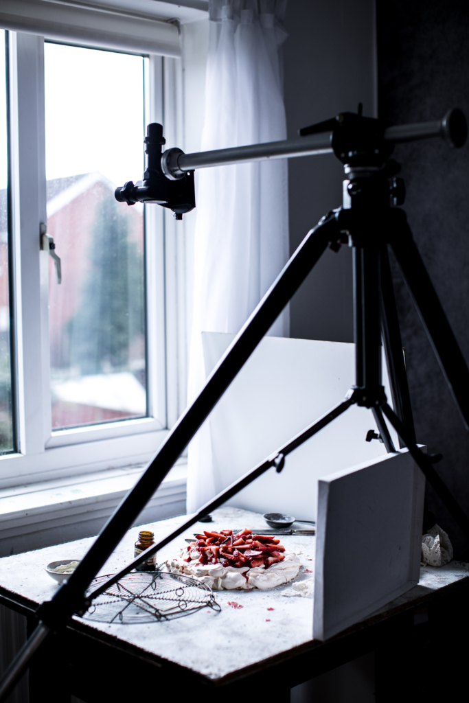
The good new is that once you know what light you want in your images, you can manipulate the one you have available to your liking. I shoot all my client images at 100 ISO to minimise the noise as much as possible and I wanted to keep my aperture here at least f 3.5/f 4 to have the important details in focus, so I shot all 3 recipes on a tripod and slowed the shutter speed down to 1/20. It was a dark day. I also added a reflector on the side and on the bottom to reflect the light and I played with the white balance to get the colour that I wanted to go for. It turned out 6000K was that perfect temperature that I liked in these circumstances.
ANGLE
To really showcase the shape of the food I chose to shoot all three recipes from overhead. The typography was also a reason for deciding to go for this angle.
ADDING DEPTH TO THE FLATLAYS
In 3/4 or straight on angle , you can create a lot of dimension by choosing to shoot at a shallow depth of field but the flatlays are a little bit more tricky. The shallow depth of field in flatlays might make some of the important element in the frame blurred and make it loose that crisp look. As the name indicates – the image you shoot from overhead can be ehhm…….flat……To add depth to the images captured from above, I am always very mindful of using layers and textures which will draw the viewer to the photograph and make you feel as if you are there, just about to grab the food. I’ll tell you all about it as we’ll have a closer look, I mean feel 🙂 at the final photographs.
FINAL IMAGES
Hand pies
Kite cookies
Eton mess pavlova

Here is where you can find the recipes —-> Sister Mag
I’d love to hear what you think and if you want to pick my brain,
I am here to answer all of your questions 🙂
And if you are interested to learn more about how to create a unique story with your images that will ‘WOW!’ your viewer every time, learn all the styling tricks and secrets to bring your photos to life and uncover the power of colour theory that will add that *special something* to your style – SAVE THE DATE – and join me on one of my WORKSHOPS on the 7th of July in The Forge Bristol . More details coming soon!
Hugs, Bea x



 drukuj
Uwielbiam wszytskie Twoje tutoriale fotograficzne. Tak dużo już się z nich nauczyłam.
Pozdrawiam i do zobaczenia za 2 tyg na kursie.
Cisze sie bardzo Ania!!!! Rany! To juz za dwa tygodnie, aaaaaaa!
Thank you so so much for all these details Bea! I love your brain and your ideas!! Lots of love to you & your amazing/inspiring work! 😘
Thank you Massiel for always finding the time to send a supportive message. Means so much! Sending lots of love your way! Hugs x
Fabulous article, so helpful and informative, thank you!
Thank you so much Rosaerona for your lovely feedback! So happy to see you on the blog x Waving from sunny England 🙂
Loved to read your blogpost Bea! What kind of lens did you use for these shots?
Thank you so much Katja! You put a huge smile on my face! I used 50mm 1.2 lens for this shot – I love it for all overhead captures 🙂
Hi Bea – absolutely loved the article and am so grateful to people like you who put this much effort into explaining what we are still trying to grasp! I recently did a photo with cherries but the one I “cut open/squashed” for effect, ended up looking dry. I tried spritzing it with water but then I think was too much. I was wondering how you managed to keep the strawberries so succulent looking? I literally want to dive into this pavlova!
Thank you so much Leo <3 I can't even express how happy I am to hear that you loved it! *doing my happy dance* right now.
And what a FAB question! If fruit are not in season and lack all their juiciness, or get a bit lifeless on set,I do agree, they certainly need a little bit of 'natural boost'.
To make these strawberries extra succulent, I tossed them with few pinches of fine sugar just after chopping and left them for just few minutes. They turned our super juicy! And it's a great tip to add extra sweetness to the fruit that isn't quite ripe yet 🙂 What I did last time I shot cherries that were cut open and started to dry out on set, I squashed a couple of cherries through a small sieve with a back of the spoon and used the juice to bring them back to life 🙂 I am all about 'edible solutions' here! Hope this helps!
It’s great to have a peek into your behind the scenes and it’s super useful to read about your working process. A lot of people dont realise how much prep goes into each photo. It always looks effortless isnt it? I am still learning to plan well what i want to shoot and so far i am not getting as far as the story telling goes. I think its an art and a skill on its own. You tell great ones 🙂 and your work is inspiration. Hearing about how you make the magic happen helps me to understand what i should take into account in the future. Thank you! Choice of props and backgrounds and colours – all of it matters. If you were to choose 3 main factors that help to create great picture what they would be?
You are so right Ekaterina, when we look at a photograph it always looks so effortless when in fact there is so much thought, time, love and energy that goes into it. Planning really makes the creative process SO.MUCH.EASIER. It allows me to connect the dots and create something really meaningful. But there are times when nothing comes to mind and that’s ok. What I do when I am not sure what I want to create, I roll up my sleeves, grab a camera and play around. When ideas don’t turn up, sometimes you have take action to entice them to pay you a visit 🙂 There really is so many things to take into consideration when creating an image – but it is a process so one little step at a time. When I think of a great food image, there are always 3 things that have to support one another – food photography (so your light, how you set your camera and how you edit your images), food styling (how delicious your food looks and how you set the scene) and prop styling (choosing the right ones to enhance your subject). It’s important to pay attention to all 3. I know it is a lot to think about, but as you practice, it will come a second nature – I promise. If you feel a little bit overwhelmed – remember it is always about food – so make sure your food looks so delicious it’s hard to resist, focus on great lightning and keep your props to minimum. I hope this helps! And thank you for being here. Hugs x
Hi Bea!
Loved reading about your creative process, what a great post!
I’ve got two questions: could you explain a bit more about what a brief is, and what it may contain? I mean, I’ve googled it, lol, but I’d love to know your experience with them.
And second: for magazines what file format you use? And do they ever request that the images have negative space for their own type?
Okay, that’s technically 3 questions haha.
Thank you for the post, excited to come here more!
Hi Diana! I am so happy to hear that you enjoyed the read! And wow! Great questions! So,the first one – the brief is a guide for the style and content of the photographs. Sometimes it looks as simple as the moodboard you can see in my post, to highlight the overall mood and what colours the clients wants to go for as well as the angle for each photograph, depending what it is going to be used for. It will also contain set of instructions like what to pay attention to. Magazine briefs are usually much more detailed, including the information of where the food should be placed (for example right hand corner), where the text is going to be to leave a blank space, what props to use, what colours, which food element to show off – so for example if there is a pesto on the sandwich, the magazine brief might indicate to place a small bowl with pesto next to the sandwich. Or if it’s a salad with poach egg, the magazine brief might say – cut into the egg to show the runny yolk.
The brief gives you a visual idea of what your client is looking for. As for the file size – it’s always jpegs. And yes, a lot of the time the photo needs to be created so that there is enough negative space for the text, but you will always be send an example of what the page is going to look like. I really hope this helps! Thank you for asking such great questions!
When you share your process it helps me to understand where I need to improve or why my photo lacked depth or texture for example. Your work does speak to me! Continue inspiring and I look forward to putting some of your process to work for me! Have a great evening!
Hey Theresa!Aaaaaaa!!!! makes me so happy to hear your thoughts! Thank you! Excited to see you on the blog x Have a super creative day 🙂 Sending lots of love!
I absolutely loved reading this post, Bea. You’ve shared so many relevant and important pointers for food photographers. I will certainly try put the mood board idea and let you know how it affects my food photography. Thanks!
Thank you Reethika! So excited to hear that you want to apply a moodboard to your work – it really is such a great tool for gathering ides! I am happy to see you here on the blog – thank you for popping round and taking the time to comment x
Always love your work and follow you. Really lovely post. From Brit food on the other side of the pond 🙂
Hey Jazz! Aw! Thank you so much! Now I’m smiling from ear to ear 🙂 Ps. Your portfolio looks so great!!!!! Sending hugs x
Beo masz talent do przekazywania wiedzy, bardzo duży talent. Uwielbiam czytać Twoje tutoriale i bardzo żałuje że nie będzie mnie na Twoich warsztatach bo czuje że bardzo dużo bym się nauczyła. Ale może kiedyś 🙂 Buziaki
Dziekuje Ci pieknie Aniu!!!! Jest mi tak milo! Sciskam x I mam nadzieje ze bedziemy mialy w koncu kiedys okazje sie poznac!
A i zapomniałam dodać że ta sesja jest przepiękna. Aż dech zapiera <3
Beatko, masz nie tylko dar bycia fantastyczna fotografka i stylistka, ale rowniez wielki dar przekazywania swojej wiedzy! Sposob w jaki opisalas swoj proces tworzenia jest tak lekki i przystepny, ze nawet nowicjusz fotograficzny po samym przeczytaniu tego tekstu jest w stanie wyciagnac najbardziej kluczowe informacje. Sam projekt jest cudowny i chyba nikt nie jest w stanie wykonac go tak idealnie jak Ty. Mam nadzieje, ze uda mi sie choc w polowie uzyskac efekt zblizony do Twojego poziomu! Trzymaj kciuki, sciskam😘
Hej kochana!Rany! Jak mi milo!!!!Nie moge sie doczekac, zeby zobaczyc Twoj projekt 🙂 Bedzie pieknie i pysznie – wiem to napewno. Sciskam Cie mocno! x
Hi dear Bea,
Really loved to read this blogpost. I’m also a favour to share knowledge and I’m still learning. Learning from your tips in your blogpost makes me enthusiastic and make me want to be aware of the details.
I’m also curious to your blogpost about the colours. I just followed a workshop and we spoke about the colours. Amazing how the brains are working and got to do a lot with foodstyling!
xx Lucie
Hey Lucie! So excited to see you here on the blog! You are always so generous with your knowledge – and very inspiring! And yesssss to colous! I am fascinated so much by how colours impact our emotions, it’s something I studied for a long time – looking forward to write a blog post about this subject 🙂 Sending the warmest hugs dear x
Dear Bea, What an important and super valuable post about how one should approach food photography. Be it for a client or for your own creative pleasure, it gives you pointers about how to create a stunning image that you will love and be proud of. It tells me all the information that otherwise would have taken a few good months to collect on my own. I enjoyed reading every bit of it. I really appreciate you taking time to explain everything that you have spend years learning. So generous of you and I thank you for that.
I was beady eyes when you explained the research and getting inspiration elsewhere. I always look at other food images for inspiration and hence I get influenced by what I am seeing. Being original is what I aim for and this articles has given me tools to do exactly the same. What an inspiring and information packed post is this! I am going through a creative low right now and you just gave me an idea of what to shoot next and how to get motivated. Thank you so much. love this post.
Awww! Suchita! Your message warmed my heart and motivated me to share even more. Thank you so much for taking the time to write such a beautiful comment and let me know your thoughts. It makes me so happy that this post inspired you, and I can’t wait to see what you’ll create next – stalking you on instagram btw 🙂 Always happy to help if you need me! Sending you lots of love – you spread your love so generously. Always. And just so you know – going through creative low is totally normal- it’s part of the creative process and it’s something we have to go through – I can relate 🙂 hugs x
Cala przyjemnosc po mojej stronie😘. Tez nie moge sie doczekac, w razie czego bede sie z Toba konsultowac😂
Hi Bea, thank you so much for finding time to write such a great blog post, it helps so much to understand the creative process and its work flow. Could you please tell me how much time did it take to do one shot for one set-up? After you had the vision for it, gathered the props and cooked, how long did it take to actually compose the shot, and did you experiment with different types of light?
The other question I have is about the theory of colour. What books or people inspire you on this subject?
Thank you so much
Irina xx
Hi Irina! Thank you for asking these questions here! They are great! It took me the longest to shoot the hand pies as my initial idea was to photograph them before baking and so I did, but I thought everything looked too neat, and too perfect, so when they came out the oven and I saw the smudged letters, I thought they looked much more interesting! Shooting them before and after baking took about an hour + the baking time of course 🙂 However the other two photos were much quicker as it worked to the plan, so I’d say around 10 minutes each after the cookies were styled and pavlova assembled. But every project is different – I did a shoot for a magazine cover once that took me 3 days to get a photo I really liked 🙂 So please don’t think that everything has to be done fast! As for the theory of colour – I researched all the information online – it’s like a gold mine 🙂 But I would highly recommend Fiona Humberstone (the brand stylist) approach to colours psychology. Her books are also great to understand how important the good business branding is. Hope this helps lovely lady! x
Thank you so much Bea for your reply, your are incredibly generous with your time and knowledge.
Have a wonderful week, Irina xxx
Thank you so much Bea !
Knowing your workflow helps me understand where I should be more intentional and plan ahead. It’s great to see how you do your magic, especially using minimal props.
Love your style !
Thank you Valerie for the love <3 Planning makes my workflow so much smoother and saves so much time - I hope it will help you too. Thank you for taking the time to write your thoughts! Hugs x
Thank you for sharing with us Bea! It’s priceless opportunity to get inside of the process, to see how the great images is being created. It helps to understand what is that draw my attention, where does this light come from, how all these lines, layers and colors are grasping my attention and leading smoothly from object to object and make me eagerly enjoying all the details.
I always love your work, and your words that “you don’t see a photograph, you feel it” are the answer to all those butterflies in my stomach when I see your new work.
Aw! You have melted my heart with your words Maria! Thank you so much, it means the world, you know? Happy these words resonated with you too, I think it is such a powerful thought. Sending lots of love your way!
Bea, I absolutely adored this post. Many creative people are not skilled at articulating their creative process. You are a gifted teacher. Thanks for letting us peek into your beautiful brain!
Thank you Cindy! I can’t wait to meet you at the London Workshop in 10 days! You can pick my brain as much as you want 🙂
This was such a great read! I can’t thank you enough for how generously you share your tips and behind the scenes. Your positive mindset is always inspirational, and I can hear your voice as if you’re reading the blog out loud!
Two quick questions: Are you adjusting your white balance as you shoot (vs. in editing) using Kelvin settings? Are you shooting tethered to see your test images with tripod flat lays?
Thank you, Bea! We <3 U!
Thank you Elaina for always being so generous with your thoughtful messages! And for asking great questions! I try to get the white balance manually as close to what I want in the camera. And yes I am all about tripod and tethering 🙂 – it might be less spontaneous but it makes my work so much easier 🙂 I do adjust white balance in the post production if needed too – the beauty of digital photography – you don’t have to get stressed if you don’t nail it straight away. I think it’s important to know what works for ‘YOU’, so experiment and do what feels right for YOU. Warm wishes!
Thank you so much Bea for taking the time to share all your knowledge. I loved this blog post- so much super useful information. I find it fascinating to see and read ‘behind the scenes’ and love your photos. 😊
Hey Annie! I am always interested in behind the scenes and how other people work too <3 It's fascinating to me too. So happy you found some useful information - I loved writing this post - although it took me ages hahaha Sending lots of love!
Beo dziękuję Ci, że tak szczodrze dzielisz się swoją wiedzą i swoimi sekretami <3 Przeczytałam uważnie post, ale też odpowiedzi na komentarze – mnóstwo konkretnej wiedzy! Nie znalazłam dotąd artykułów na temat współpracy z magazynami kulinarnymi, a uważam, ze temat jest szalenie ciekawy. Cudownie było poznać Twój sposób pracy. Ściskam z Polski :*
Czesc Zuzia! Jak fajnie cie tu zobaczyc! Ciesze sie ze cie sie podobal artykul! Napisalam cos, co sama chcialabym przeczytac jak uczylam sie fotografii 🙂 Nikt nigdy nie pisze o swoim procesie pracy – a juz tym bardziej o pracy dla magazynu 🙂 Bedzie wiecej!!!!
Thank you Bea for sharing this wonderful piece. As a newbie food stylist & photographer, I’m constantly reading up on the subject but nothing is more valuable than understanding the practical applications of those theories – exactly what your article brings forth. Reading it has given me a totally new perspective on how to approach projects using 2 keywords – emotion & feel. So, thank you!!
I would like to ask if you’ve done commercial photography as well? What would you say is the biggest difference between the creative process for commercial versus editorial food styling & photography?
PS – can’t wait to see you in Bristol in July 🙂
Hey Dyutima! So sorry to reply with such a delay! Makes me so happy to hear that you find this article helpful! Emotion and feel are very powerful tools to use in photography – something very important to me.
To answer your question: commercial photography is simpler(but it doesn’t mean it’s easier) than editorial in my opinion,as the full focus goes on the food itself and not the story. Therefore the shoot will always require you to think outside the box to make sure the food looks absolutely perfect! Often in an exaggerated way! I did a commercial shoot of a crumble once, when I had to cook the fruit and the crumble separately to make sure it doesn’t go mushy and looks extra delicious. Hope this helps 🙂
Oh Bea! this post is so great for those ones who want to learn and improve our photography skills. Thank you so much for being so generous with your knowledge. Thank you thank you thank you!! please never stop, I wish I could go to one of your workshops some day, I’m a little far though 😛
Each time I read your posts or your explanatios about anything, you do it in such a way that it’s so clarifying for me… Each time I understand a different aspect of my own work… I see how my images are random, without any story or any intention, or notice so many lacks and mistakes, I know it sounds sad jaja but NO!! actually it’s so great! I love it! there is nothing worse than feeling your work is not good enough but not knowing what is wrong with it, there is no way you can improve if you don’t understand what is going on 🙂 So thank you again.
If it is not much to ask, I’d love to know about this colour theory and psicology, if you could explain a bit about it, cause I never take any special considerations for the colours I use, I just see if they look good to me haha, if you are rolling your eyes I understand!
Hugs!!
Hi Sara!!! Your message made my day – thank youuuuu! So happy you find this post helpful! I love your way of thinking and I can relate to what you say about understanding what might be wrong with our images and trying to improve as we grow as photographers. I think that is the best mindset a photographer can have! Not being sad about the mistakes but learning from them!
And no, I am not rolling my eyes 🙂 I am glad you asked! You should go with your gut for sure as we all see colours differently, and the colour combinations I like might be different to the one someone else find eye pleasing, so do listen to your heart. If you would like to learn more about what colours works, I highly recommend working with colour wheel. Just google colour theory, click images and ta-dah, you will see various theories. For example complimentary colour theory is based on colours that are opposite each other on the wheel – like for example orange/beige and blue. So if you are not sure what to photograph orange food on (think pancakes, biscuits, pasta, waffles), the complimenting colour would be blue (it could be blue background/a blue plate or maybe a blue napkin) 🙂 I hope this helps!